Your guide to navigating Toronto's underground pedestrian maze.

My Role

UX Designer

Ideation team lead

Project Duration

3 Months

Industry

Self-service technology

Team Members

Grace Yip

Boyun Leung

Amy Lester

Marcus Chen

Salem Schewai

Project Context

Conducted for a master's level fundamentals of UX course.

Problem

Toronto’s PATH is notoriously difficult to navigate. Current maps and signage are confusing and inconsistent, often leaving people disoriented or lost. Plus, with spotty cell service, it's impossible to rely on navigation apps. This situation highlights the pressing need for a more straightforward solution.

Solution

We designed an interactive wayfinding kiosk, which offers PATH users personalized, step-by-step directions to their desired destination. The best part? They can download the directions directly to their device and reference them on the go.

My Role

UX Designer

Ideation team lead

Project Duration

3 Months

Industry

Self-service

technology

Team Members

Grace Yip

Boyun Leung

Amy Lester

Marcus Chen

Salem Schewai

Project Context

Conducted for

a master's level UX fundamentals course.

Conducted for

a master's level

UX fundamentals

course.

Problem

Toronto’s PATH is notoriously difficult to navigate. Current maps and signage are confusing and inconsistent, often leaving people disoriented or lost. Plus, with spotty cell service, it's impossible to rely on navigation apps. This situation highlights the pressing need for a more straightforward solution.

Toronto’s PATH is notoriously difficult to navigate. Current maps and signage are confusing and inconsistent, often leaving people disoriented or lost.

Plus, with spotty cell service, it's impossible to rely on navigation apps. This situation highlights the pressing need for a more straightforward solution.

Solution

We designed an interactive wayfinding kiosk, which offers PATH users personalized, step-by-step directions to their desired destination. The best part? They can download the directions directly to their device and reference them

on the go.

We designed an interactive wayfinding kiosk, which offers PATH users personalized, step-by-step directions to their desired destination. The best part? They can download the directions directly to their device and reference them on the go.

Research

Objective

To understand the challenges that users face when navigating the PATH, specifically focusing on wayfinding and navigation issues. The goal is to identify the shortcomings of the current wayfinding system, and gather user feedback for improving the experience.

Methodologies

Surveys

44

Qualified Responses

Format: Online


44

Qualified Responses

Format: Online

Interviews

12

In-depth

semi-structured

interviews

Observations

4

Covert sessions

Duration: 1-2 hours

Key Findings

67%

67%

67%

of our participants

have overall negative perceptions of the PATH

77%

77%

77%

of participants found the PATH's current way finding systems unhelpful


of participants found the PATH's current way finding systems unhelpful


of participants found the PATH's current way finding systems unhelpful


88%

88%

88%

of our participants

have previously gotten

lost in the PATH

Reasons for Using the PATH

Despite its wayfinding challenges, users report utilizing

the PATH for its connections between transit points, protection from the weather, and its amenities.

Inadequate Wayfinding Signage

The PATH’s signage lacks distinctive landmarks and

"you are here" markers, making navigation confusing. Inconsistent signage design adds further uncertainty.

Inadequate Wayfinding Signage

The PATH’s signage lacks distinctive landmarks and

"you are here" markers, making navigation confusing. Inconsistent signage design adds further uncertainty.

Reliance on Building Names

Current signange and maps heavily rely on building names, which is ineffective, particularly for those unfamiliar with names and locations of Toronto buildings.

Unclearly Marked Entrances and Exits

Entrances and exits within the PATH are not clearly marked, posing challenges for users trying to find their way in or out.

Unclearly Marked Entrances and Exits

Entrances and exits within the PATH are not clearly marked, posing challenges for users trying to find their way in or out.

Difficulty Locating Businesses

Users report difficulty trying to locate businesses within

the PATH Information regarding the location and operating hours of these businesses is not clearly communicated.

Personal Wayfinding Methods

Users have resorted to personal navigation methods,

such as exiting the PATH to orient themselves at street

level or relying on their memory from previous trips.

Personal Wayfinding Methods

Users have resorted to personal navigation methods, such as exiting the PATH to orient themselves at street level or relying on their memory from previous trips.

Reliance on External Resources

Due to unhelpful PATH signage, users resort to external resources like Google Maps. However, these resources

are limited underground, where cell reception is poor

and the PATH’s layout is inaccurately represented.

Reliance on External Resources

Due to unhelpful PATH signage, users resort to external resources like Google Maps. However, these resources are limited underground, where cell reception is poor and the PATH’s layout is inaccurately represented.

Quotes:

Quotes:

“I've lived here all my life and still get lost in the PATH!”

reddit u/poodleaficionado

"If I don't have time to figure out my route ahead of time, I won't bother using the PATH."

Interviewee, Age 23

Analysis

Persona

Based on insights from our research, we created our persona to better understand the goals, needs and obstacles of our target users. Meet Lost Lisa:

User Journey

To better empathize with our target users, we mapped out Lost Lisa’s current journey to gain a better understanding of her experiences in the PATH. As a team, we voted on her strongest pain points, as indicated by the blue stickers below: 

Needs Statements

Based on the user journey mapped above, we developed four main needs statements. Lost Lisa needs a way to:


  1. Identify her current location so she can feel confident about her route.

  2. Find the most efficient route, so that she can arrive to her destination on time.

  3. Avoid unpleasant weather without getting lost so that she can arrive to her destination in a comfortable/presentable manner. 

  4. Know the location of amenities/services, so she can better utilize the PATH.

Ideation

Big Ideas

With Lost Lisa’s needs in mind, we delved into ideation and development, here are just a few ideas we explored:

Prioritization Grid

We evaluated and voted on the impact and feasibility of each idea. Based

on the results, we mapped some of our most feasible, and impactful ideas

on the grid below:​

Prioritization Grid

We evaluated and voted on the impact and feasibility of each idea. Based on the results, we mapped some of our most feasible, and impactful ideas on the grid below:​

Prioritization Grid

We evaluated and voted on the impact and feasibility of each idea. Based on the results, we mapped some of our most feasible, and impactful ideas on the grid below:​

Winning Idea


PATH KIOSK


An interactive wayfinding

kiosk offering navigational

assistance and directions

for users to reference.

Implementing wayfinding kiosks throughout the PATH landed the

highest in terms of feasibility and impact for our users. That's because:

  • It's the most customizable when it came to meeting user needs.

  • It solves technical constraints within the PATH such as faulty cellular reception.

  • It’s beginner-friendly, ensuring that people don’t need to prepare anything in advance to utilize it.

  • It’s future-proof; as things change in the PATH, the information shown on the kiosk can change accordingly.

Wireframing and Prototyping

Wireframing and Prototyping

Design Goals

Based on our solution, we came up with three desired outcomes for Lost Lisa:​


  1. Lost Lisa can access personalized step-by-step directions that are readily available while navigating the PATH.


  2. Lost Lisa can locate amenities and services without previous PATH knowledge.


  3. Lost Lisa can identify her current location in the PATH without seeking additional guidance

Low-fidelity wireframe

As a team, we began brainstorming and drawing out some low-fi wireframes

to satisfy our design goals outlined above.
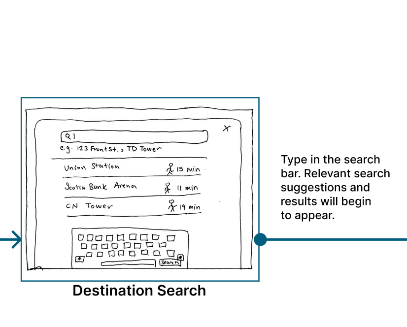
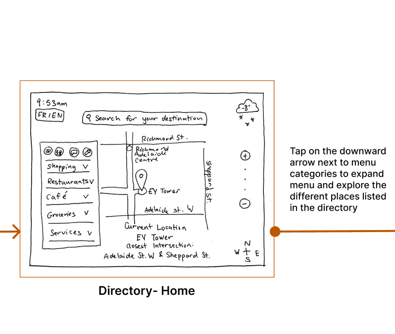
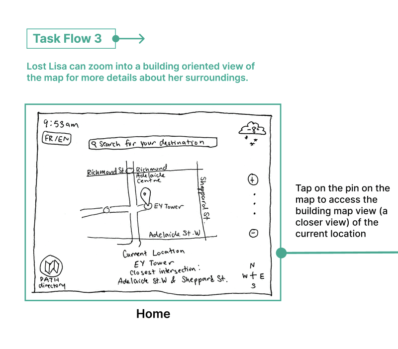
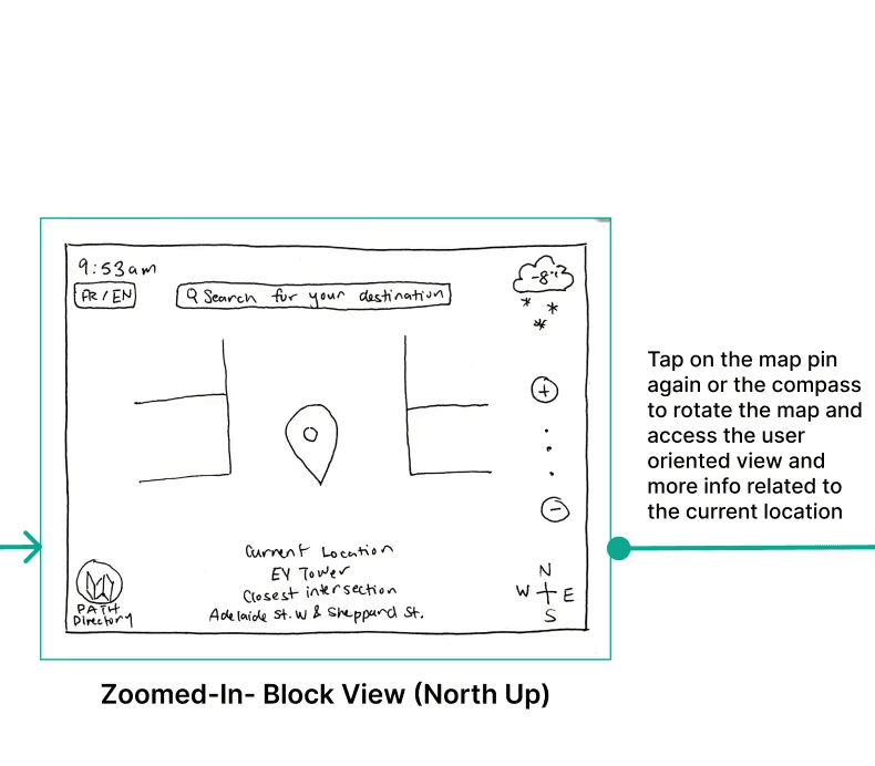
Task flows

Through this process I created three key task flows:

Lean evaluations

Next, I tested our initial designs by completing lean evaluations with 2

representative users using the Guerilla testing methodology.


They provided positive feedback:


As well as some suggestions for improvement, which we were able to iterate on:


Mid Fidelity Prototype

Next, we implemented our findings from the lean evaluations and created a

clickable mid-fi prototype to demonstrate our solution:

Mid Fidelity Prototype

Next, we implemented our findings from the lean evaluations and created a clickable mid-fi prototype to demonstrate our solution:

Usability Testing

To evaluate the usability of our mid-fi prototype, I was in charge of conducting usability testing with 4 representative users through moderated and think-aloud methodologies, followed by short interview sessions. ​Through this, we gained valuable feedback as summarized below:


👍 Positive feedback

  • Users appreciated the comprehensive PATH directory.

  • Step-by-step directions were clear and user-friendly.

  • Popular destinations auto- populating under the search

    bar was a hit.

  • The closest intersection feature was found to be very helpful.

  • Multiple options to send directions were well-received.

  • The ability to zoom out for a full PATH map view helped users

    with orientation.

👍 Positive feedback

  • Users appreciated the comprehensive PATH directory.

  • Step-by-step directions were clear and user-friendly.

  • Popular destinations auto- populating under the search

    bar was a hit.

  • The closest intersection feature was found to be very helpful.

  • Multiple options to send directions were well-received.

  • The ability to zoom out for a full PATH map view helped users with orientation.

👎 Areas for Improvement

  • Icons on the PATH directory need labels for clarity.

  • The fingers icon, indicating map manipulation, was confusing.

  • The purpose of the “Start This Way” icon was unclear.

  • A search bar on the PATH directory page would enhance searchability.

  • A blue shadow on the home page to indicate orientation is needed.

  • The PATH directory and other icons were hard to locate and got lost in the map details.

Next Steps

To ensure that we’re continuously empathizing with our users, we hope to address the following suggestions and user feedback that was out of scope for this iteration:


Device Compatability

Expand our solution’s device compatibility (desktop, and mobile), allowing people to plan ahead before they enter the PATH.

Language

Incorporate more languages to ensure the kiosk is accessible to a wider variety of Toronto tourists and residents.

Accessibility Features

Add a voice recognition feature, allowing for spoken commands, Additionally, embed a built-in screen reader, enabling people with visual impairments to use the kiosk.

3D Map and Tilt

Implement a 3D map to improve users' spatial awareness after referring to the on-screen map.

Multiple Stops

Being able to add multiple stops would help create a cohesive navigation plan when making multiple pit stops.

Next Steps

Next, we implemented our findings from the lean evaluations and created a clickable mid-fi prototype to demonstrate our solution:

Key Takeaways

Iterative Testing

The iterative nature of usability testing proved crucial. Each test phase revealed new challenges and opportunities, emphasizing the need for flexibility and ongoing refinement in design.


Accessibility Considerations

Another valuable takeaway from this project is the importance of integrating accessibility considerations early in the design process. In future projects, I intend to incorporate accessibility as a fundamental aspect of the initial design phase, promoting usability for a broader audience.


Ideal vs. Feasible Solutions

This project illuminated the delicate balance between ideal solutions and practical constraints. While a complete overhaul of the PATH’s infrastructure might be the optimal wayfinding solution, this was not a viable option. Instead, our product-focused approach, though less extensive, promises to significantly enhance the user experience within the existing PATH framework.


© Kristina Brown 2024

© Kristina Brown 2024